
Of all the rooms in your house, the living room provides the most freedom for you to express your personal style and interests.
Depending on your budget and the amount of space you have to work with, you can get creative with your furniture and layout. Even if your furnishing options are fixed, you can make a dramatic difference in the design by choosing a color palette that reflects your taste. Read on and be inspired by nature’s color palettes.

When you’re planning your color scheme, it helps to have an idea of which colors might work nicely together in your interior space, and what kind of effects you can achieve. Are you looking for a tonal variation of a single color, a harmonious and restful palette of colors that share a similar base, or complementary and contrasting colors that deliver maximum impact?
To get an idea of the wealth of options that the world has to offer, HomeAdvisor has taken inspiration from six of nature’s most iconic landscapes and visualized the different effects their color palettes have on a single living room layout.
Grand Canyon (Arizona, USA)
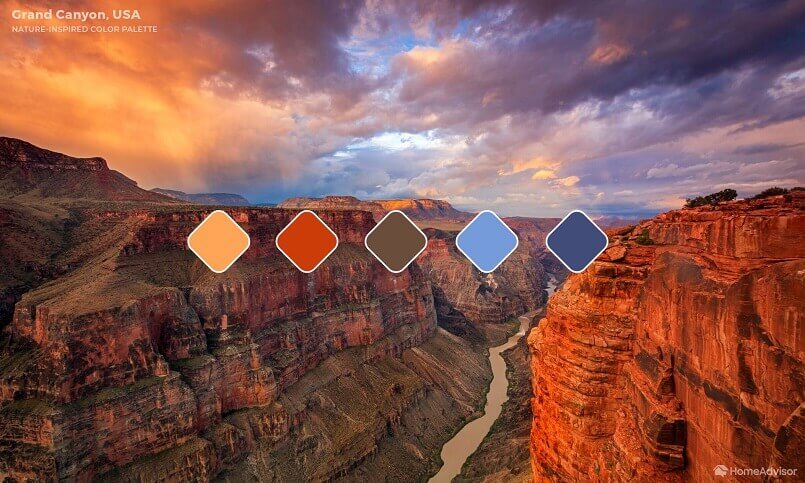

Give your living room a vibrant pop of complementary color by punctuating a base of warm orange and yellow with bright blue soft furnishings. The wooden cabinet tones well with the walls. The cactus plant gives a subtle nod to Arizona’s desert lands.
Great Barrier Reef (Australia)


Apply a rich palette of contrasting colors to create this sophisticated effect. The deep marine teal of the walls is lightened by the coral yellow sofa and the lighter green of the dramatic house plants. The soft purple armchair and footstool tie this palette together.
Yellowstone Caldera (Wyoming, USA)

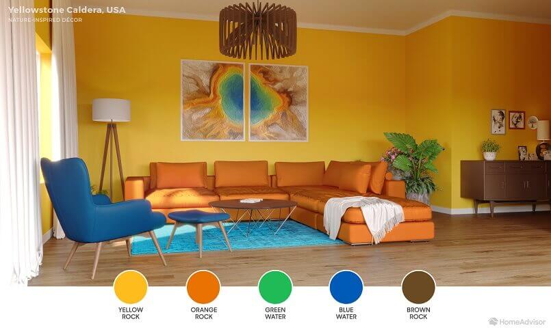
Create an inviting space with a tonal base of warm yellow walls lined with a stripe of bold orange by the sofa. The darker wood of the cabinet provides a stronger tonal variation in this palette, while the deep blue of the armchair and bright green of the small plant together add an electrifying pop of contrast.
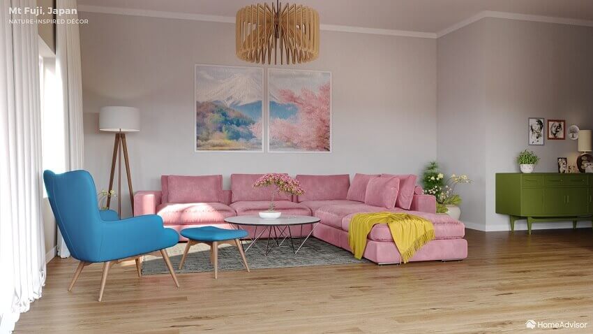
Mount Fuji (Honshu Island, Japan)
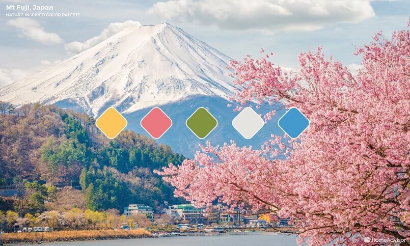

Provide a peaceful and harmonious space for guests to relax with this soft, tonal palette inspired by the snow-capped Mt Fuji in the springtime. The subtle grey background of the balls tones gently with the pastel cherry blossom pink, while the forest green cabinet and sky blue armchair offer a little color contrast, as well.
Banff National Park (Alberta, Canada)
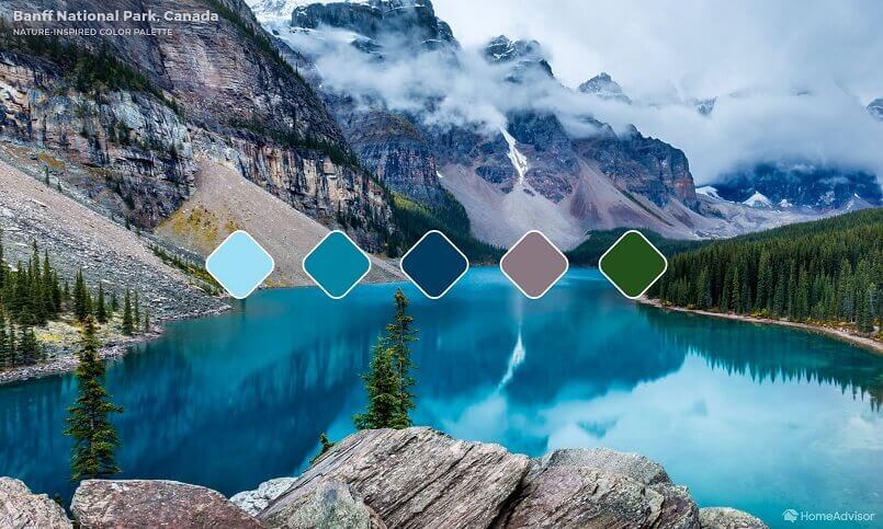
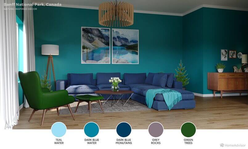
Achieve a mature atmosphere by focusing on one area of the color wheel and allowing tonal variation to create depth and interest. This palette of blues and greens delivers the calming sensation of a cool mountain landscape, with just a hint of natural wood detail to complete the effect.
Serengeti National Park (Northern Tanzania)
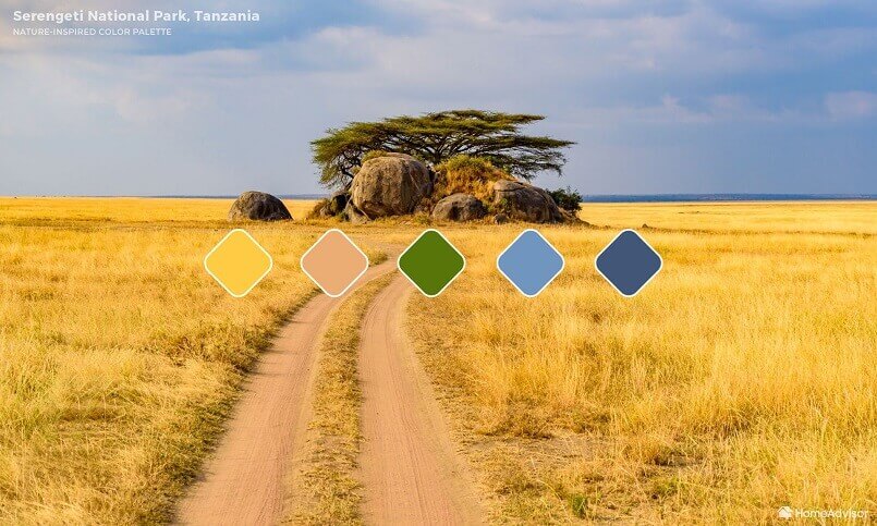

Make a statement with this bold color scheme, which off-sets the deep green backdrop of painted walls and lush foliage, with a block of rich orange in the long sofa and rug, and the strong blue armchair and footstool. This is a confident and sophisticated color palette that would impress any guest.
For more creative ideas, you are welcome to follow Archi-living.com on social media.
Color Trends – Create a Colorful Interior Design – Discover More
Inspired by Nature – Photo Quotes – Have a Look