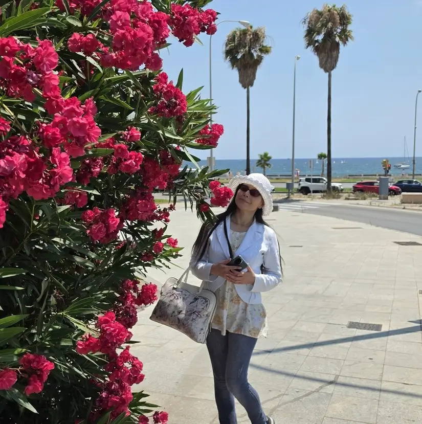
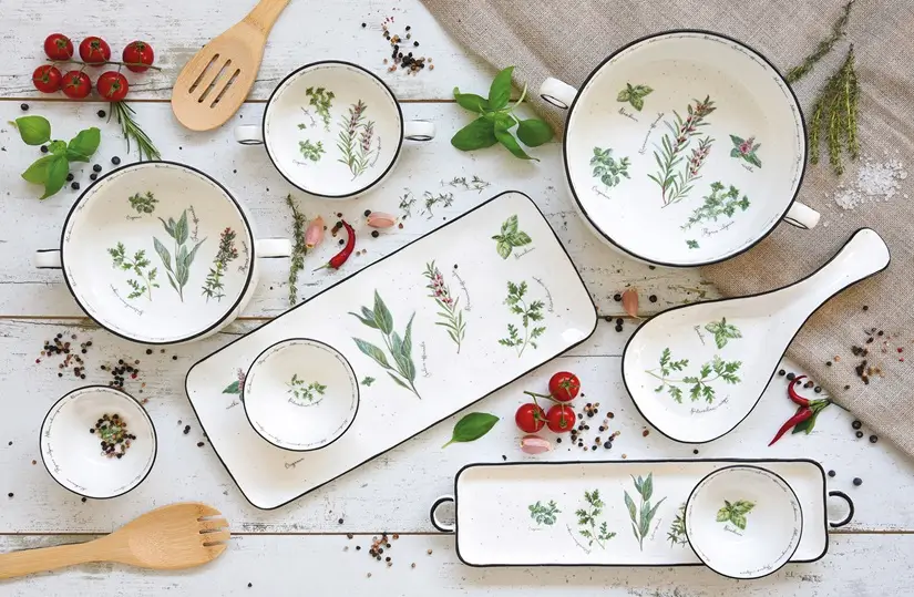
Colors are a key element of interior design, as well as of non-verbal communication and branding. They communicate with us – they affect our mood and how long we stay in a space. They also reveal something about us, including our personality, and sometimes our profession and company, to our surroundings. As a color lover and design communications pro, I talked about colors with tportal. In this article, discover part of the interview: How to Choose Colors in Design & Branding.
Learn more about choosing and combining colors when designing residential and commercial spaces, the role of color in creating your personal or professional style, design trends, refreshing your home with the help of color, and how color affects us.
What is your favorite interior design style and why?
“Interior design is full of wonderful styles, and new ones are often created by combining two or more interior design styles. For example, Japandi (a mix of decorative ideas from Japan and Scandinavian countries) or Tropicandi (cheerful tropical color palette combined with Scandinavian neutral tones).”
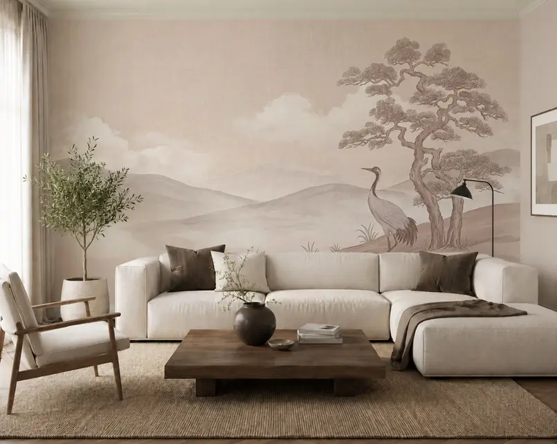
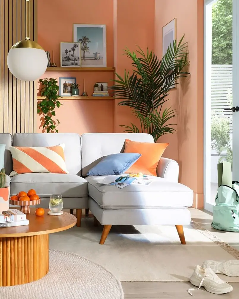
“Furthermore, eclecticism (mixing styles) is increasingly present in interior design and creates unique spaces. It is precisely the combination of styles I prefer. Namely, combining existing styles and creating a new one allows for the design of unique interiors.”
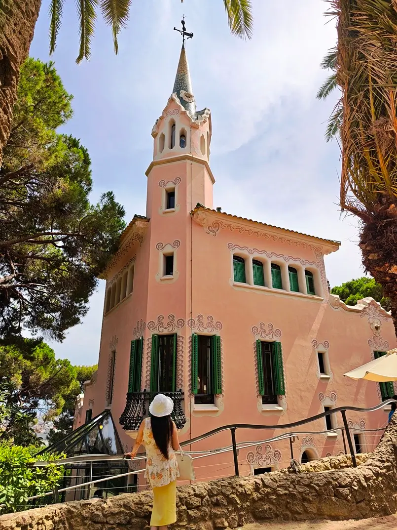
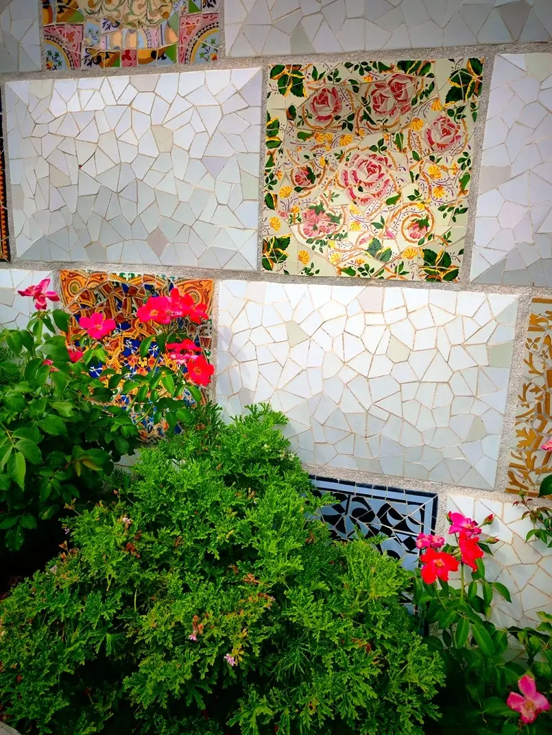
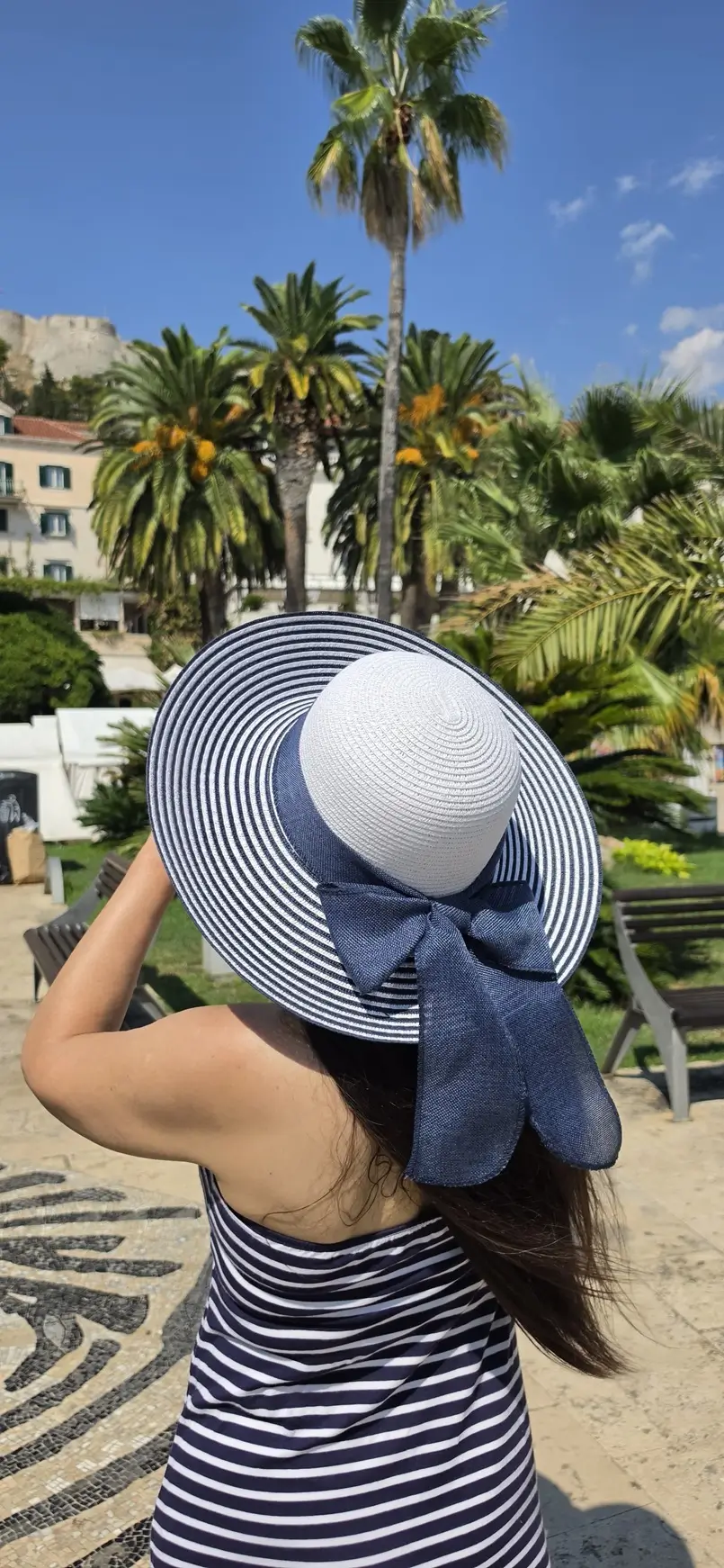
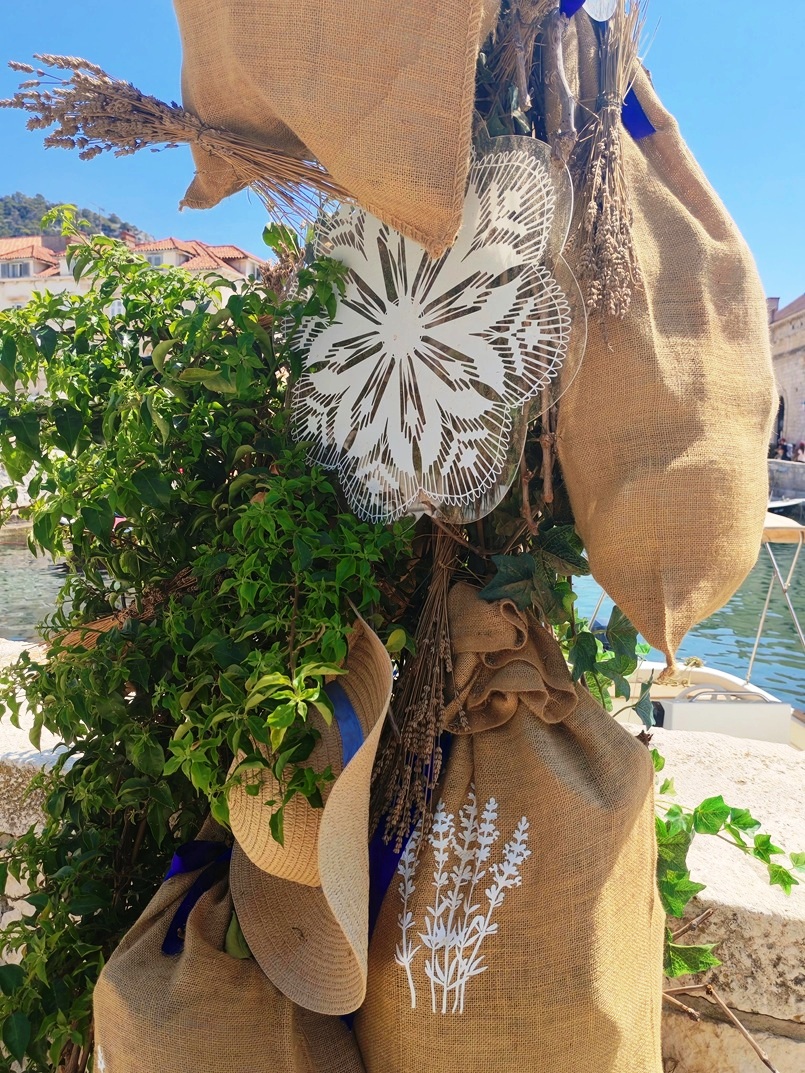
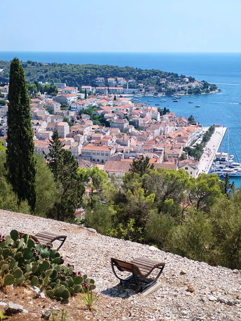
“Among the styles that have been present on the design scene for a long time, I would like to highlight the Mediterranean style as one of my favorites. Namely, the Mediterranean color palette reminds me of my native Dalmatia and my favorite Hvar Island. White, blue, green, and earthy tones are the basis for the design of relaxing spaces in the Mediterranean, and the energetic colors of flowers, fruits, and vegetables represent the joy and passion that this beautiful region is known for.”
Related Article: Top Trends – Enjoy the Best Interior Design and Decorating Styles
What colors do you like to apply the most in certain rooms?
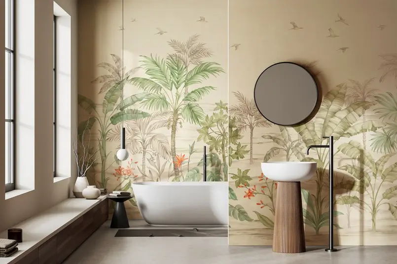
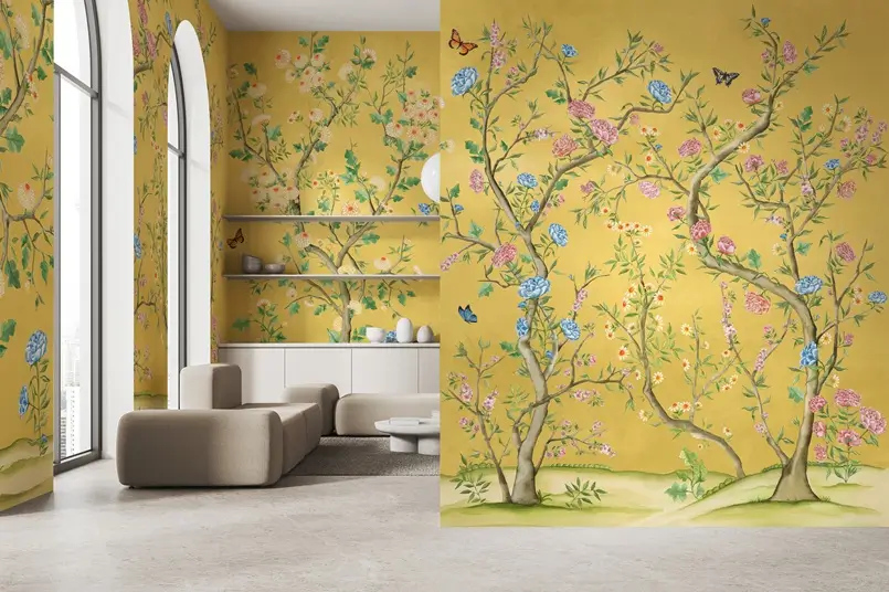
“I am a fan of colors and the creativity they bring to a space. I love seeing them at every step and in every situation. Since colors in interior design come from nature, I divided the color palettes in certain rooms of the home according to the four seasons. The living room and home office represent spring. The cheerful colors and playful shapes on the walls and furniture seem to have arrived from a spring garden or meadow. Relaxing green tones prevail in the living room, and creative colorfulness inspires me in the home office. The bathroom design is inspired by summer and the sea. In the bedroom, autumn colors create a comfortable space for relaxation. Winter tones and patterns cool the cooking heat in the kitchen and dining room.”
Related Article: Earth Day Love: 4 Seasons of Colorful Decorating
What are the key rules for choosing interior colors?
“When choosing colors for interior design, it is advisable to ask a few key questions first. Is it a large or small space? For example, in a small space, light and cool colors make it look more spacious.”
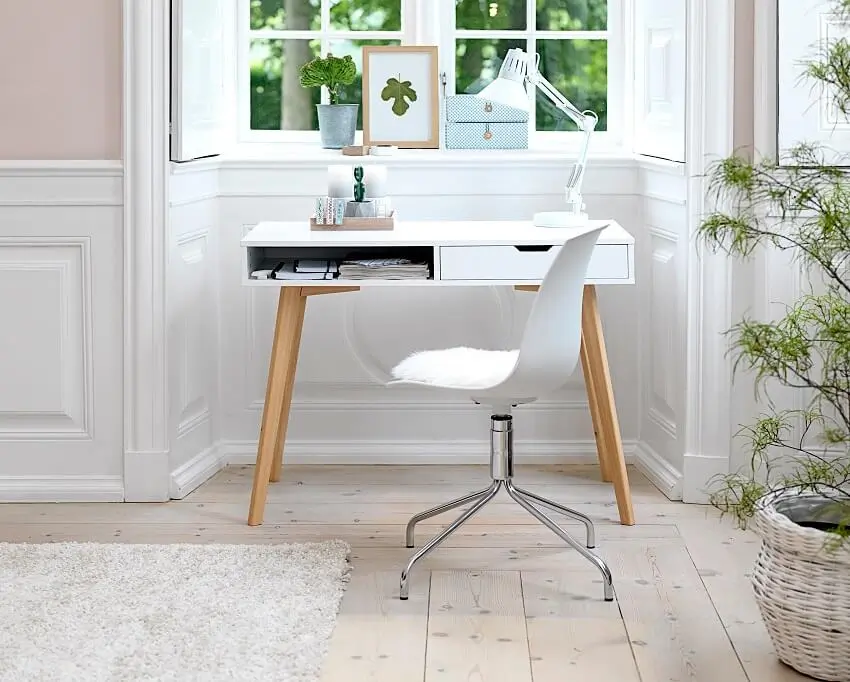
“What is the function of the space? Office or residential space, living room, bedroom, kitchen, dining room, bathroom, hallway, or foyer. For example, in the living room and bedroom, the optimal color palette facilitates relaxation (neutral tones, blue or green). In the home office, red, purple, and yellow will have a creative effect.”
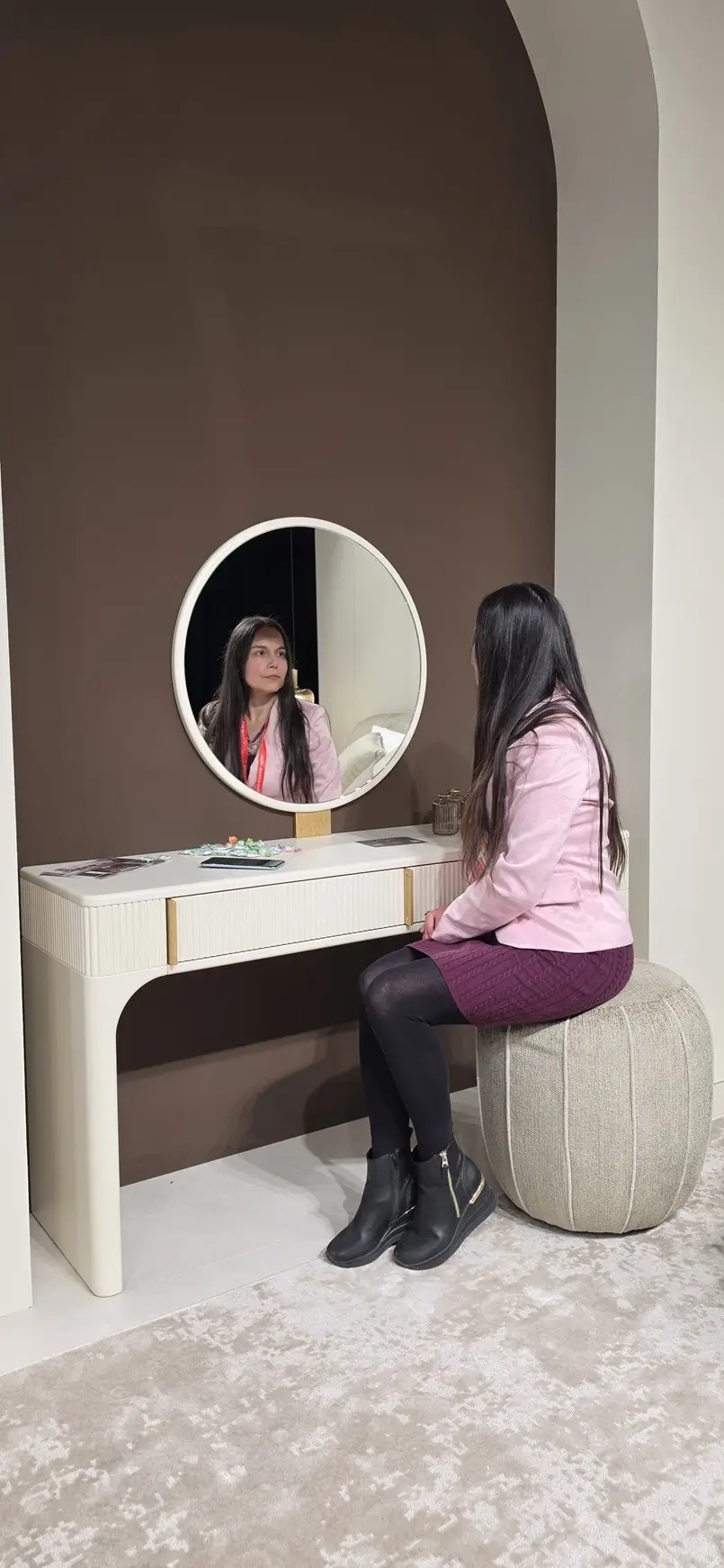
“What is the style of the interior space? Classic or contemporary, minimalism or maximalism, one style or a mixture of styles (eclecticism)… Each style has its own color palette. As an example, the neutral tones of Scandinavia or the energetic colors of Spain.”
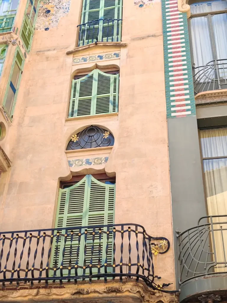
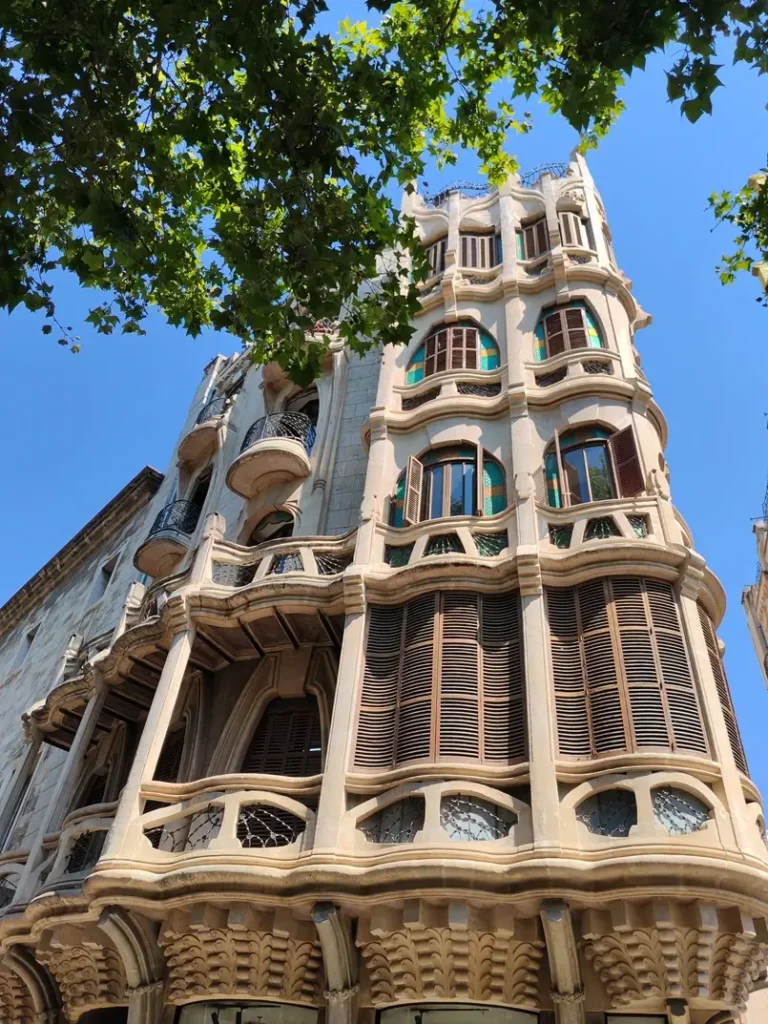
“How do interior designers combine colors in the interior? When it comes to combining colors in the interior, designers most often suggest a palette made of two or three colors. The 60-30-10 design rule recommends that 60% of the space should be painted with the main color (walls, floor, ceiling, large pieces of furniture), 30% with another color from the palette (small pieces of furniture, curtains, small rugs), and 10% with an accent color (vases, decorative pillows, and other decorative accessories).”
“Choosing colors is a very broad topic that I have written many articles about. I have listed a few key rules here, and you are welcome to find more information in the articles on Archi-living.com.”
Related Article: How to Choose Colors Like an Interior Designer – Pro Ways
How can we refresh our home with color and decor without spending a fortune on a complete paint job and a major redesign?
“When we enter a space, we first notice colors (especially intense colors) and then shapes. So, if you want to refresh your interior with minimal investment, paint one wall or one piece of furniture that will attract attention, choose new curtains and decorative pillows that will stand out in the space with their colors and patterns, and sometimes even a makeover of just one piece of furniture will be enough – especially if you choose decorating techniques that will create a star in the interior from a neutral piece of furniture. Place that piece of furniture in a prominent position to attract attention. In other words, create a focal point with colors and patterns that will draw the admiring gaze of everyone who enters the room.”
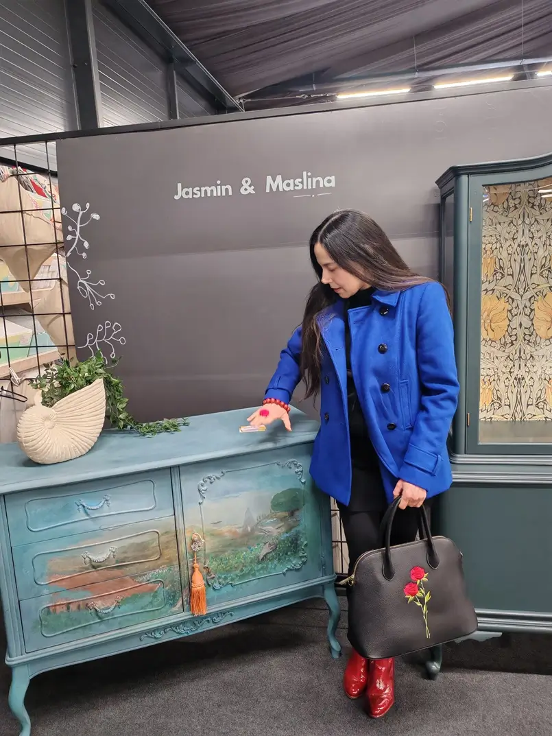
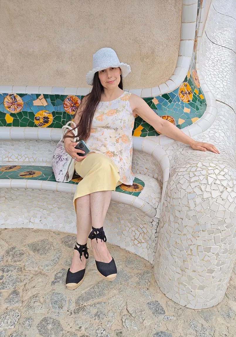
“The same applies to fashion styling. How to refresh your outfit without buying all new clothes? One item of clothing or accessory in vibrant colors will draw the attention of people around you and thus refresh your outfit. For instance, one day wear a neutral-toned dress or suit with red shoes, and another day wear a pink jacket with that neutral-toned dress or suit. What do you think the people around you will notice first? Hint: a piece of clothing or an accessory in vibrant colors will draw their gaze.”
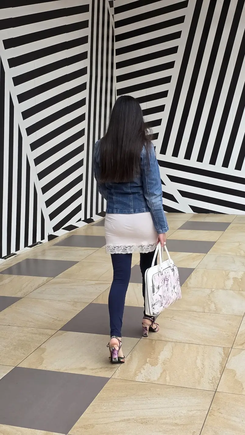
“How do colors communicate your personality? If you wish to be perceived as artistic, wear vibrant colors, as they communicate creativity and passion. If your personal brand is like that of an engineer, precise and analytical, neutral tones and dark blue might be the best choice for you, as they convey a rational way of thinking.”
Related Article: Vibrant Effect of Colors on Your Life, Communication, Brand
How much influence do colors have on our mood? Can you give an example?
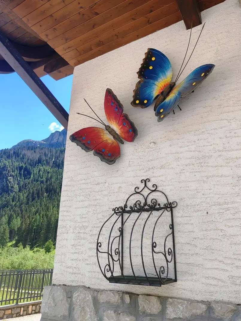
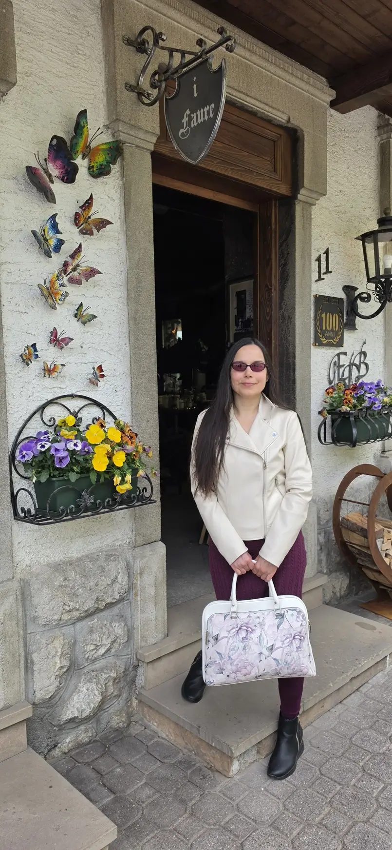
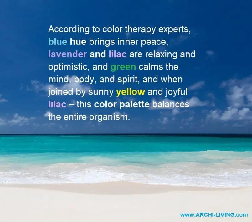
“According to numerous studies, colors have a significant influence on our mood. Colors in the interior affect us similarly to the colors we encounter in nature. For example, how do we feel when we look at the blue of the sea or the green of the forest? Relaxed. In interior design, blue and green also create a relaxed environment. Additionally, blue is known as the color of communication and is often applied in spaces where calm communication is encouraged. We often say that green is a balm for the eyes.”
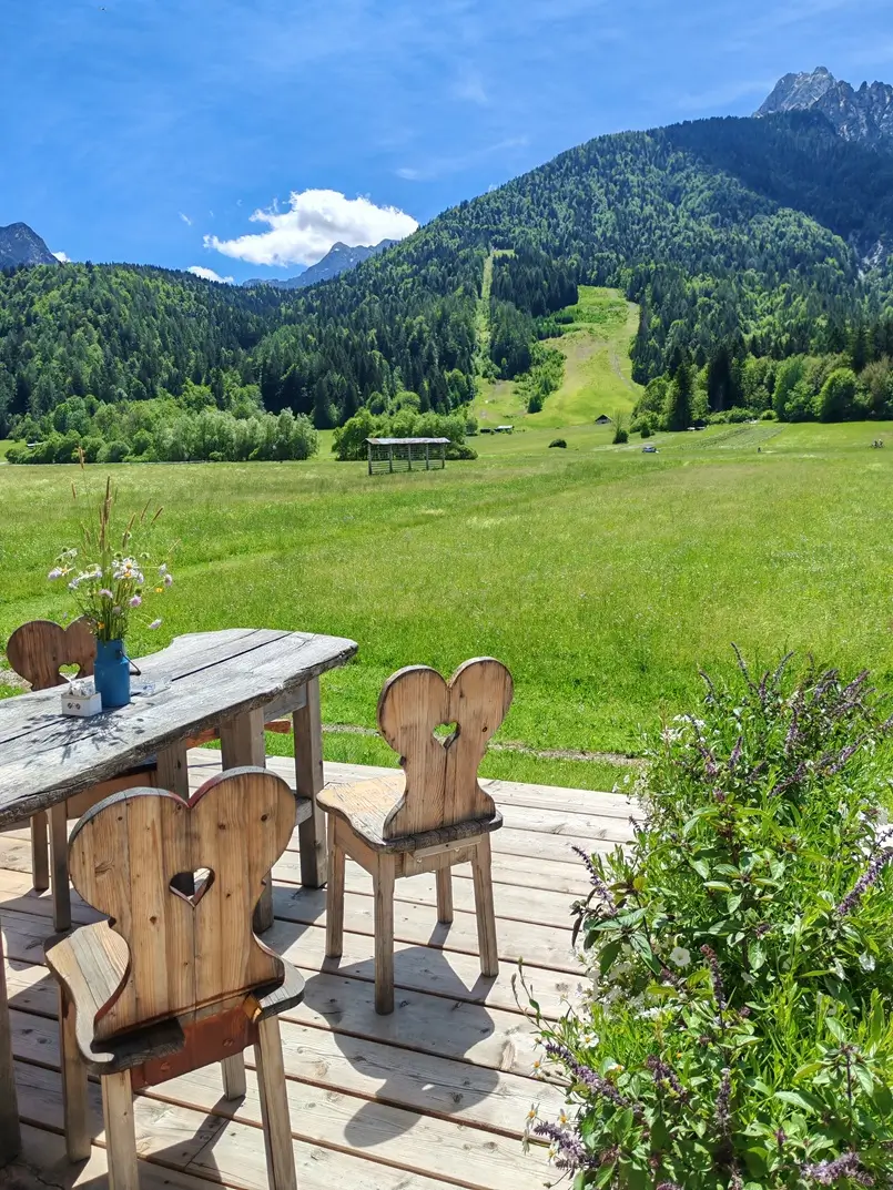
“Do we think more optimistically on a sunny day? Yes. The same is true of yellow in interior decoration. This sunny color is associated with optimism and learning. For example, in rooms with no natural light (no windows), we often paint the walls in pastel shades of yellow to make them appear sunnier.”
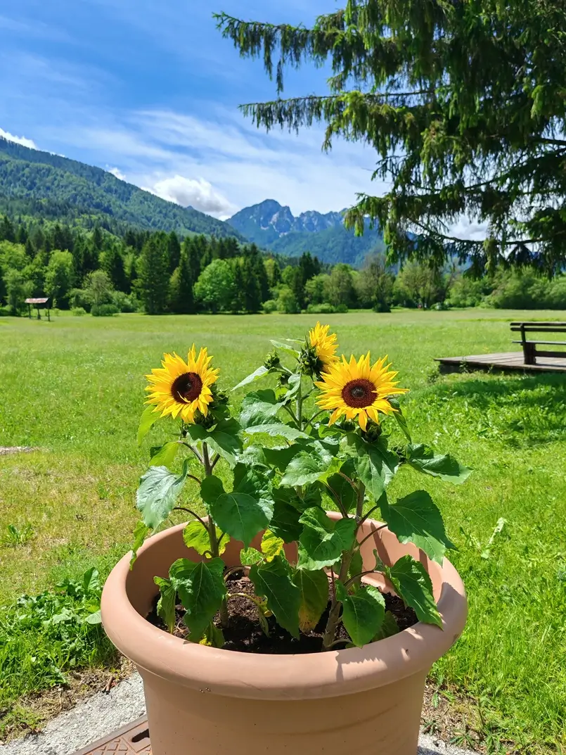
“Furthermore, yellow, orange, and red are known as appetite-increasing colors. These energetic colors are most often introduced into the interior as decorative details and smaller pieces of furniture.”
“It is important to emphasize that the appearance of colors in a space is significantly affected by the intensity and color of light (natural light entering through windows and doors or artificial light from interior lighting fixtures). Light intensity and color affect our mood and productivity. In other words, light is the beginning of the story about colors.”
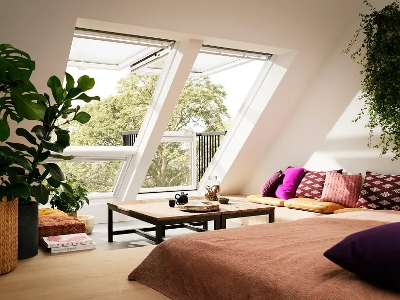
“Therefore, when choosing interior colors, consider the number and position of light sources (how many windows and doors there are, how many lighting fixtures, where they are located). Additionally, light color affects interior surface colors (walls, furniture, decor). The intensity and color of natural light change throughout the day, and the intensity and color of artificial light are determined by the interior lighting. Lighting and interior colors are broad topics that could be explored in more depth. Feel free to find more information in the articles on Archi-living.com and from interior designers and architects in the Community of Interior Designers – ZADIN.”
You can read the entire interview (in Croatian) on tportal: Uštedite novac: Dizajnerica interijera savjetuje kako oživiti dom pomoću boja.
More about colors and styles, design trends, news from the world of design and architecture, advice from interior designers and architects, projects from around the world, and inspiration for traveling with style – discover in my articles and social media posts. Colorful wishes from Danica Maričić, Design & Travel Communications! 🙂
For more design & travel communications, you are welcome to follow Danica Maricic, Editor-in-Chief, on Facebook, Instagram, and LinkedIn, and discover these related articles.