
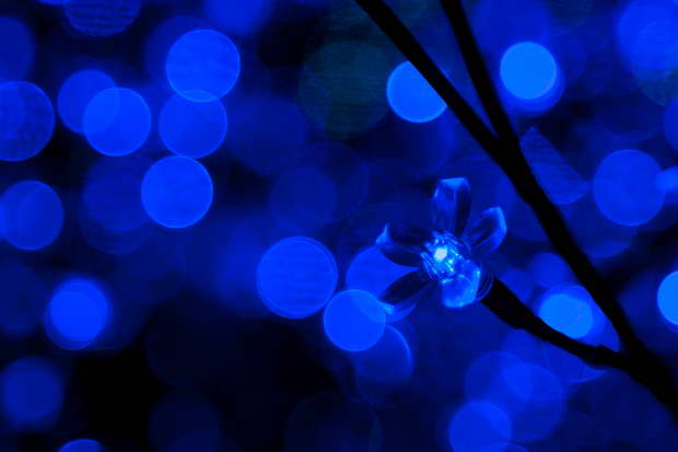
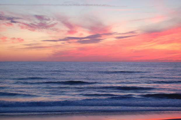
The magic of blue color is present throughout the year. This lovely hue is a great addition to every design and decor scheme. Blue is the color of calmness, meditation, relaxation, inspiration, and communication.


Primary Colors – Blue, Red, Yellow
The coldness of the blue color greatly “silences” the heat of the remaining two primary colors – fiery red and sunny yellow. By combining these three primary hues, all the other colors of the spectrum are created. For example, the union of blue and red brings purple into this colorful world, while blue and yellow create a sight for sore eyes – a green hue.


The primary colors blue, red, and yellow are often applied for decorating children’s rooms, as well as other indoor and outdoor areas in which we want to encourage activity and learning.

Complementary Pair – Blue and Orange
The orange color is made by combining red and yellow. This warm hue highlights and complements the cool hue of the Sky. Let’s recall the aesthetic effect of a terracotta vase on a blue tablecloth, pillows in the peach color on a dark blue blanket. The colors blue and orange are a complementary pair – opposites that attract and bring each other into balance, thus creating dynamic and active indoor and outdoor spaces.
Relaxing Color Palette
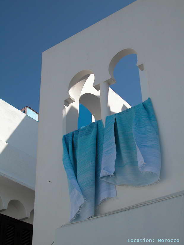
If you want to create a room for relaxation, the harmonious (analogous) color scheme designs the bedroom or living room made for relaxation. Combine blue tones with purple, pink, or green. The blue and white combination is always a great choice. The harmony of blue and white creates the essence of a relaxing Mediterranean lifestyle.


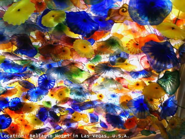
This popular color reflects light, which is particularly evident when decorating with shiny fabrics and surfaces. Fabrics such as silk or organza in tints, tones, and shades of blue are very decorative, as well as objects made of glass in blue.
Decorating Small Interiors with Light Tints
Bright tints of blue are often applied in decorating small interior spaces. Walls painted in these tints seem more distant than they are, thus creating the illusion of more space.
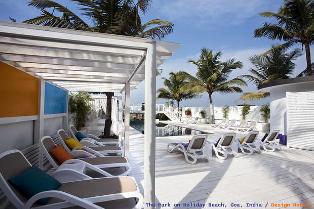
The relaxing, refreshing, elegant – blue hue is suitable for designing all rooms in the home – bedrooms and living rooms, kitchens, dining rooms, and bathrooms, as well as home offices. Also, this beautiful color of the Sea is an often choice when designing and decorating hotels, restaurants, bars, shops, and offices.


What does your love for blue color say about you?
It is said that those people who prefer light tints of blue are creative, imaginative, sensitive, practical, and analytical.

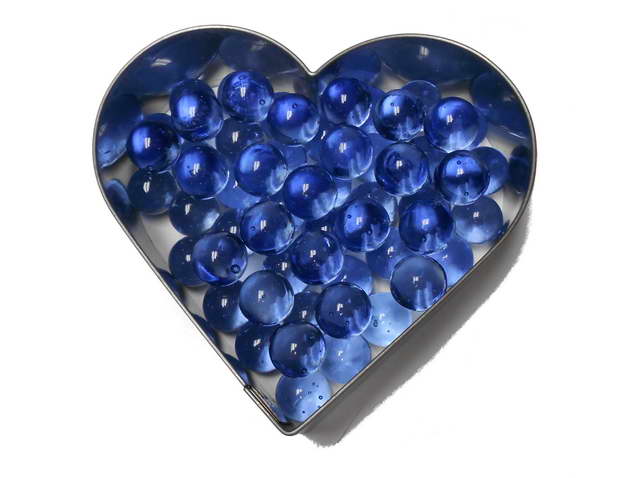
If you prefer darker shades of blue, you might recognize yourself in this description – an independent and responsible person who finds it easy to make decisions and needs peace and quiet.

Under the common name – blue – there are a large number of interesting tints, tones, and shades of this attractive color. Let’s discover them together.
For more creative design and decor ideas, you are welcome to follow Danica Maricic, Interior Designer, on social media.
The Symbolism of Colors – Discover More
A Colorful Journey to Dalmatia – find out more about the natural color palette inspired by this beautiful travel destination in Croatia.